Punk Rock’s Timeless Influence on Graphic Design
The punk movement of the 70s influenced not just the music scene, but also the visual worlds of art and graphic design. The art featured a do-it-yourself approach, reflecting the anti-establishment sentiments of the rough, unrefined rock music popular at that time. These designs exude a sense of rawness in the overall look or in the means of the production.Some designers during the Punk era did go to art school. Notables are Jamie Reid and Malcolm McLaren. However, the majority of the artists didn’t have any formal training in graphic design. The practitioners did have a few things in common: a passion for music, a camera, a pen and a pair of scissors. Just like the bands they followed, these visual artists used cheap instruments to create their art. The finish products were often described as edgy, indecent and rude. During the Punk period, the most popular forms of music art were fanzines and album covers. Bands created music with inexpensive instruments and pressed their own records. They churned out fanzines reproduced on photocopiers. Their albums were sold at gigs and independent stores, and often featured hand printed covers. The artists were given the freedom to create whatever they like. That’s why Punk cover art was considered provocative and crass–or the combination of the two. (1)
„A pen, a camera and a pair of scissors –
just like you only need some cheap instruments
and three chords to start a band.“
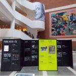
Exhibition at The British Library
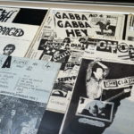
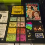
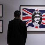
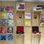
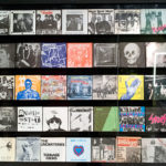
In London, there was an Exhibition until January 2017 at the British Library, where they exhibit the visual media from the punk period. They shows punk’s impact on graphic design from record sleeve art to fanzines and T-shirts. There were a dazzling wall of album covers, ranging from the Sex Pistol’s “Anarchy in the UK” to Stretcher Case Baby’s “The Damned.” This was an incredible exhibition for Generation X-ers who want to relive their punk years, or for Millennials who want to know more about that scene.
Here are some impressions…
Dead Kennedys – The Art of Winston Smith
The filmmakers Bryan Ray Turcotte and Bo Bushnell take a unique approach to exploring the rich histories of these three seminal punk legends by focusing on the influential imagery and seeking out stories that have not been told yet through the artwork, which is integral to the importance and influence of each band. On June 11, 2013 – The Art Of Punk debuts on MOCAtv with an episode on Raymond Pettibon and the artwork of Black Flag.
On this episode of The Art of Punk we hit head on with the art behind the legendary Dead Kennedy’s. From the chaotic, surreal, madness, of collage mixed with political folly that blazed their LP’s and gig flyers; to the razor edge ultra simplistic four simple line DK symbol. In San Francisco we corner founding Dead Kennedy’s member Jello Biafra, and discuss his own warped inspiration for the many sleeves and posters created in the early days of the band. Back in Los Angeles we talk with pop surrealist artist Tim Biskup about how the DK’s affected and twisted his own young mind, and Steve Olson graces us with a few words of wisdom. Finally we meet up with master collage artist, and designer of the DK’s symbol, Winston Smith in his North Beach art studio, and talk about how he was drawn into the early Bay Area punk scene – and his long and creative artist relationship with the Dead Kennedy’s and Jello Biafra. (3)
Quelle:
(1) www.afm424.org
(2) www.digitalartsonline.co.uk
(3) www.youtube.com
